

The Los Angeles Chargers unveiled their new logo Wednesday in arguably the biggest flop of a logo release in sports history. After harsh backlash created a PR nightmare, the team went on to alter the design 3 times on Twitter.
Not only is the design somewhat predictable and lazy, it’s also technically a poorly made logo. The angles, the perspective – all not executed at the level you’d expect from someone designing a logo for an NFL franchise.

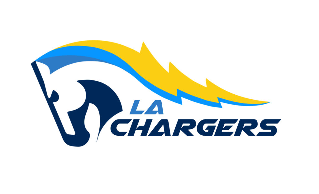
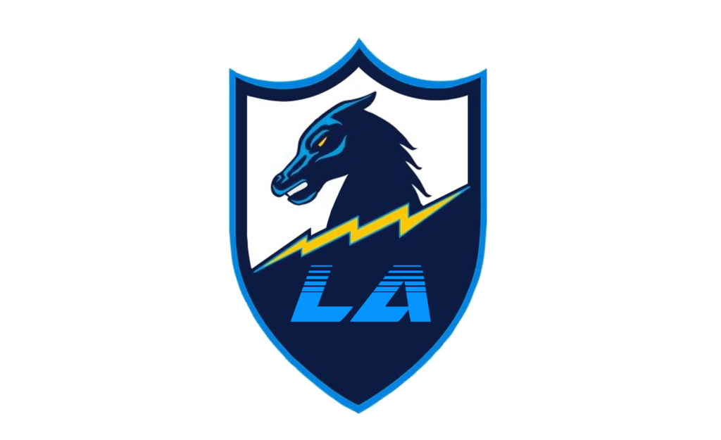
In the days after the unveiling, fans began throwing together designs that all could rival the official logo the team chose.

If the team wanted to stick with the design, all the could have done is packaged it differently. Though the “minimalist” style they chose is stylish in some respects, it was easy to predict those not say with design, which is essentially 99% of the people viewing the logo, to see it as lazy.
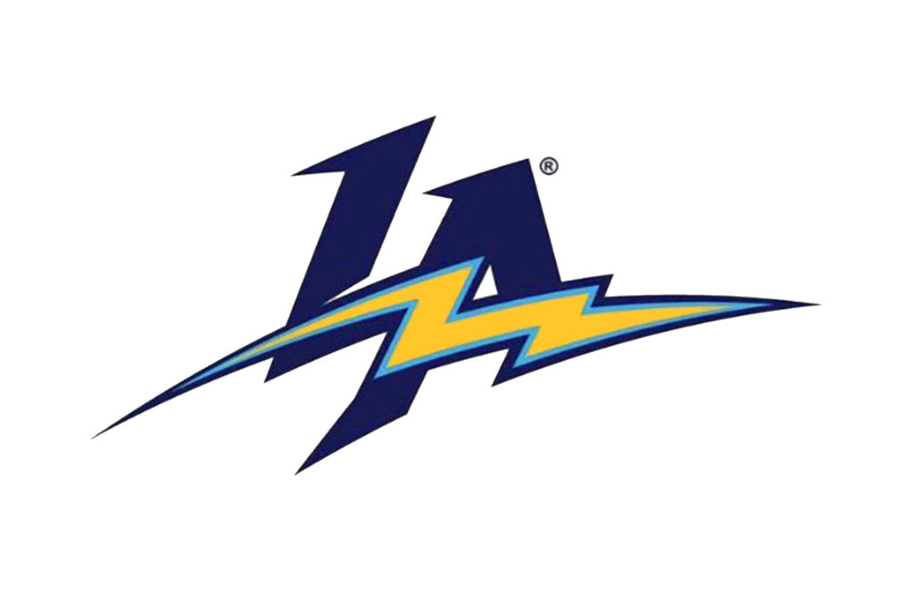
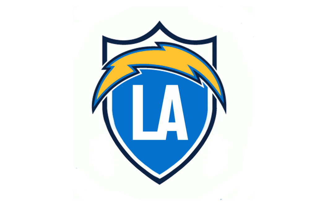
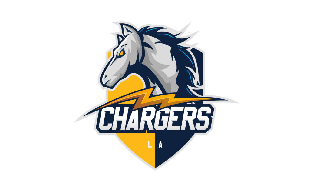
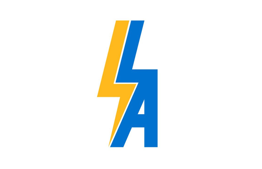
All they could have done is simply package it better, which can be seen in iterations below.
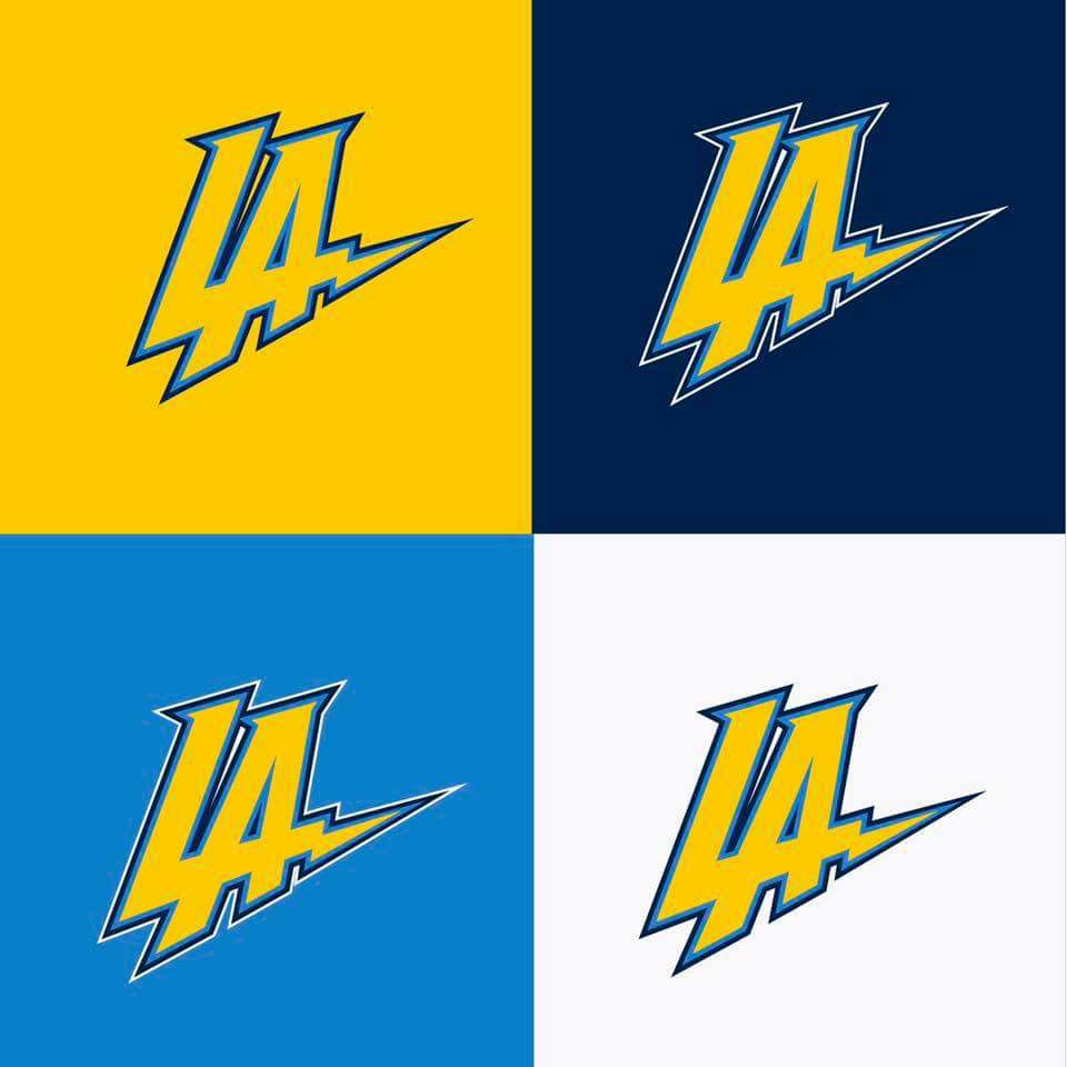

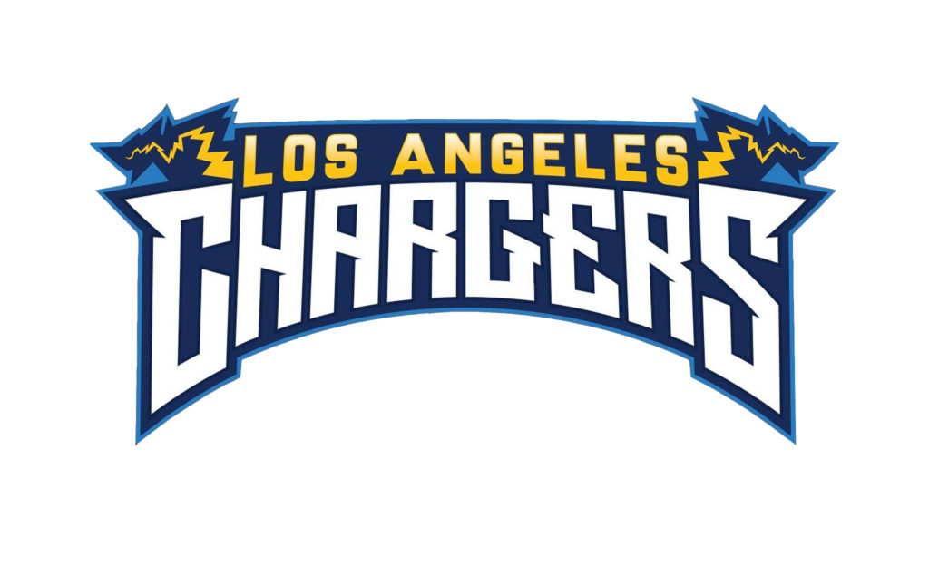
One more groundbreaking idea – how about keep one of the best logos in football?
")

")


