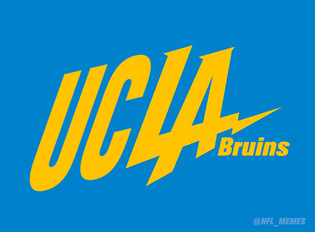
Just 24 hours after the LA Chargers revealed their new logo, they have presumably succumbed to the PR firestorm of backlash following its unveiling, adjusting the design.
According to a new report, the team has adjusted the logos paying homage to the retro powder blue, synonymous with the Chargers of old, including when the team originally played in Los Angeles.
New Chargers logo has been adjusted. Team displaying updated version with powder blue, yellow. pic.twitter.com/fUcRfF1JnS
— Michael Gehlken (@sdutGehlken) January 13, 2017
We now suspect UCLA made it a threesome when the LA Dodgers and the Tampa Bay Lightning got frisky and created this logo 9 months ago.
inlineg


