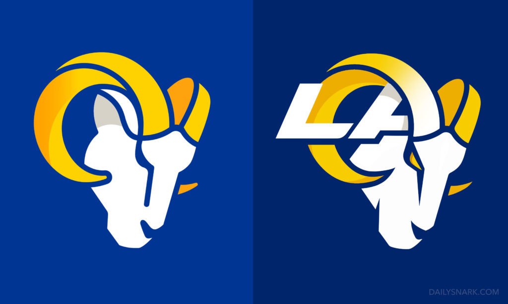
The Rams unveiled a new identity today, complete with new colors and a new set of logos, much of which isn’t been taken with acclaim.
After being leaked on Twitter two weeks prior to its official release date, fans ripped apart the design on social media. Despite the backlash, the team opted to still release the logos.
The Rams new logos. pic.twitter.com/n140OVxJ6R
— Lindsey Thiry (@LindseyThiry) March 23, 2020
The new secondary logo is a complete ground-up makeover of the classic ram head design that has been used since the team’s conception.
The team was looking to combine a modern, minimalistic style with a retro feel, and the design ended up looking flat, boring and anything but aggressive with rounded curves.
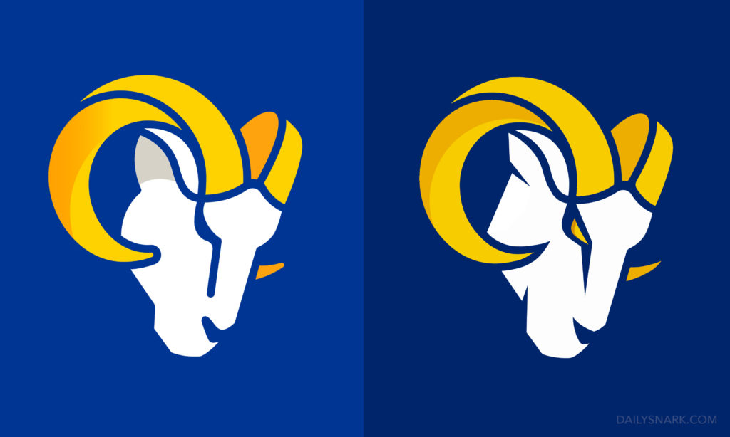
Saddened by the design that has become the face of a billion dollar organization with any and every design resource at their disposal, we hopped on the couch and opened up Illustrator to gave the logo a quick glow up. While the overall design is still amateur looking even after the tweaks, it serves as an example to the Rams for what could have been.

It took a whopping five minutes.
Here’s an alternate without the ‘LA’ attached:


