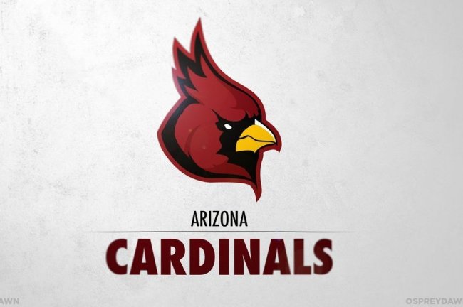
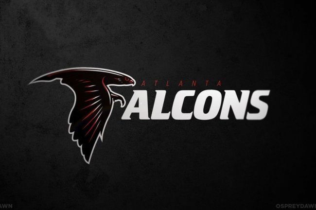
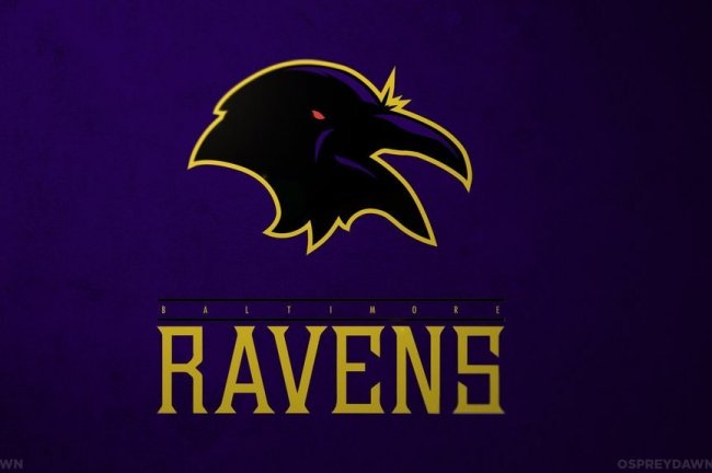
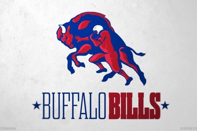
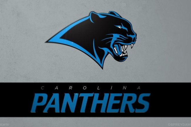
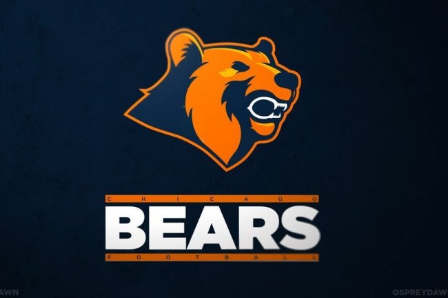
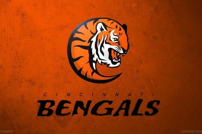
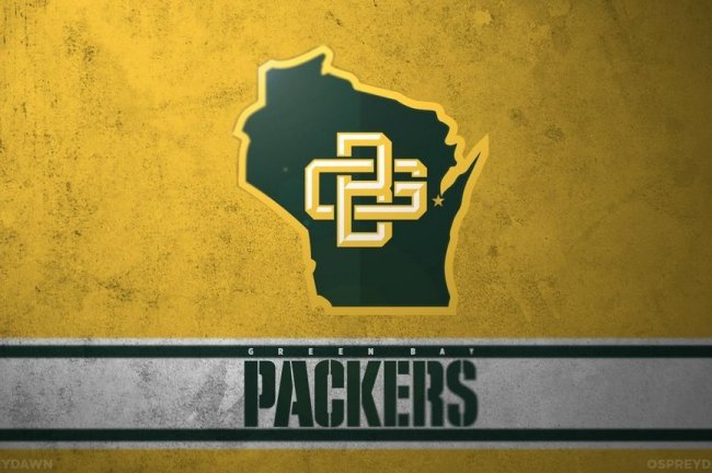
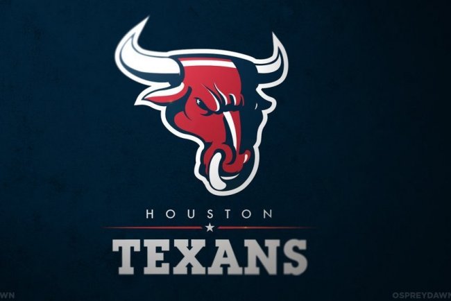
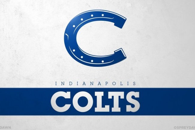
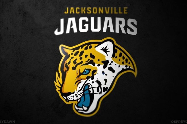
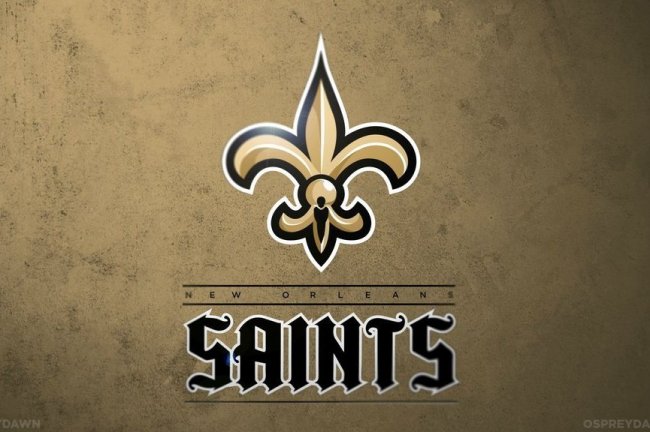
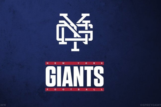
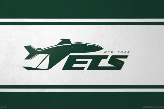
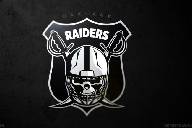
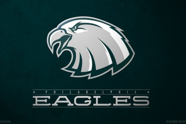
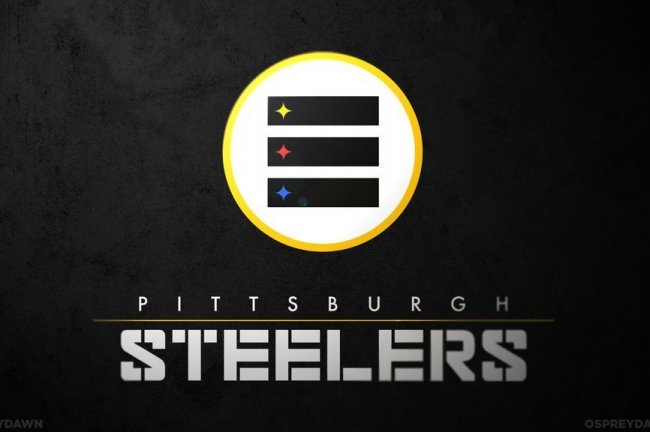
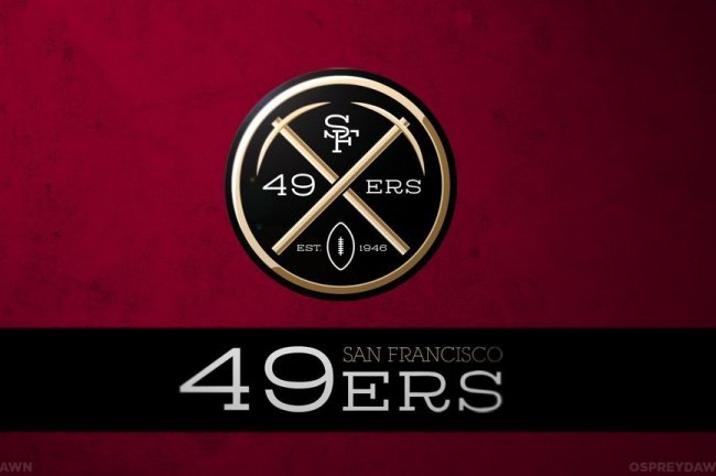
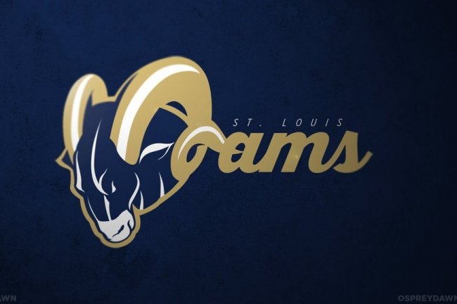
Graphic Designer Max O’Brien (@OspreyDawn) redesigned every NFL teams logo and it looks amazing! Let us know what you think of your favorite teams new logo design in the comment box!
This is horrible. Falcon looks like a bat. Raven can’t even be made out, actually all the birds look ridiculous. The Bengals looks like some short of tiger shrimp.The Packer is just ugly as sin.NYG is terrible. Just complete ass to tell you the truth
Jas2
someone hates his life.
Jas
Lol it’s called a opinion. If it sucks, I’m gonna say it sucks lol. You can be a dick rider if you want to. I’ll speak the truth
Brandon Price
Opinion does not equal truth.
Jas
Speaking the truth meaning my true opinion.Not a suger coated fake response. Do you really need to be guided through things that takes common sense?
Sean Bigbabyjesus Ronan
I AM ALSO ANGRY ABOUT THIS FOR NO REAL REASON. I GOT YOUR BACK!!! RAHRAHRAHRAHRAH!!!
Take a walk bub.
Jas
You’ve mistaken opinion for anger. And then type in caps and smash random letter like a juvenile. You’re a clown lol
Michael Melro
your just one of those people who doesn’t like to go with the flow if you want to say something your gonna say it. If it sounds angry, ignorant or just plain stupid you say it…yup im describing a troll. Go find a cave somewhere and only come out at night because no person with a relevant opinion cares about what you have to say Jas.
Jas
Lmao. You sound like the whiny little kid that has been a follower all his life. If its popular, you’re gonna hope on the bandwagon and do it. If someone goes against it you have a little fit. Literally the same as the teenage girls raging about Bieber slander on twitter. That’s exactly what you look like. Get your lame ass out of here
Mark Mann
not to take jas’s side on this, but it seems you care, or your paragraph wouldn’t be here
Jacob Benjamin Taylor
Do you think this is a motherfucking game?
Justin
The Falcons suck azz anyway… They might as well be a bat… It’s an improvement! WHO DAT !!
juniorvilla
Ok so there is absolutely nothing wrong with disliking these logos. Yes, you are totally entitled to an opinion. I am a graphic designer, but I also do not like ALL of these logos as well. For example, the Ravens logo is too dark and you cannot make out the contours that make up the face. With that said, in order to do a productive and a real critique is it important to give reasons why you do not like something( which you do for the most part) but also refrain from just saying its just complete ass. Just saying you do not like something or it’s terrible does not validate your argument and in fact hinders it. You could say the logos become too busy or the color schemes do not work, things like that. Now, it is your opinion but MY opinion would be your reasoning could be detailed out better.
Jas
Well I’m not a pro critic so I really could of cared less about giving the proper critique. I get where you’re coming from though. I still think the majority of it is just plain terrible. Not sure why every team with a C has to be shaped to the letter or how every animal other than the Bronco looks so bland like it was taken from a photo album. The only one that is decent is the skins. But other than that, they are terrible
juniorvilla
yeah the GB logo looks like a baseball team logo. I get where it’s trying to go, but it is a maze. Honestly, the Bengals logo creeps me out. Like a tiger/alien hybrid ready to eat you with its huge mouth and tiny body
Jas
And it’s in the shape of Wisconsin. Not a good look.Eagles and Seahawks are just weird and awkward looking.But on a positive note, anything is better than the Titans current logo. So thumbs up for that
Betty Bj Mawyer Harris
COMMON SENSE TOLD ME IT WAS PACKER related but as a Packer fan it still took me a moment to in my head go through the “maze” and completely understand it was a G inside a B…
Camron
You can have an opinion but there’s no need to be a cock sucker about it.
Jas
Tough criticism is the best criticism. How do you expect the guy to be better if you treat him like a child and talk up his work when its poor. Let him know exactly what you think of it and don’t pull any punches.People are so soft nowadays it’s ridiculous. Stop being a bunch of pansies. He should thanking me for being brutally honest.
http://sportingnerds.com Sco Jo
Some of them aren’t my thing either, but hey it’s fun to see the exploration. Keep hating people for trying, while not offering anything yourself. It’s what keeps the internet running!
ed
tiger shrimp sounds really good right now.. mmmm.
Linda Waliser
Oh GOSH I have already purchased two different NFL team cotton material to make future quilts…to bad they didn’t come out with this before the Winter fabrics were printed…..
Mark Ventrice
these arent real…..
Gene Beesley
If these were real, I’d like em
Danielle Celmer
I love the Steelers one!
GreenMonstah
i dont even get it. whats with the three bars?
Richard Alan Kleszczynski
Fun fact I learned in school.
The colors were chosen to promote the attributes for steel: yellow
lightens your work; orange brightens your leisure; and blue widens your
world. The logo’s meaning was later amended to represent the three
materials used to produce steel: yellow for coal; orange for iron ore;
and blue for steel scrap.
Tommy Gardner
The three bars refer to the three rivers in Pittsburgh: the Allegheny, Monongahela, and the Ohio.
Patrick Stump
The Steelers logo is supposed to look like the American Steel logo. I dislike the change. The only one I want to see on the field is the Bills thing
Michael McHale
Like the Bills ,Browns and Raiders redesigned logos ,the others …not so much and Hell No @ Cowboys
GreenMonstah
yeah, dont fuck with the texas lone star
ww
as a sox fan, what the fuck are you doing liking the cowboys? Or are you just another bandwagon little bitch?
Nick
Not a whole lot to bandwagon at the moment…
fjwalker1959
You don’t mess with the Packer’s “G” logo.
Boner Brigade
Their G logo is gay as shit
fjwalker1959
Not as much as your screen name little gurl. Now get off your daddy’s computer
Will I Am
G is for Gay
Camron
Your name is Will I Am shut up.
Tmer
the gb logo they used was actually their logo for 1959-60
Betty Bj Mawyer Harris
AMEN BROTHER PACKER BACKER!!!! GO PACK GO!! It’s all about that G!!!!
Joe Willis
Broncos, Chargers, and Buccaneers would be improvements..The others fail.
Tom Foy
As a Giants fan, I personally miss the old helmet logos, but I think this new one would look better than one we have now; it’s classy
The Man
I think these would be cool for merchandise, but I resist change so I wouldn’t like to see the actual team logos change.
Jacob Benjamin Taylor
Bucs? I could see them being like HELLL YEAHHHH
Richard Alan Kleszczynski
Agreed. Except next time It’ll say the L.A. Buccaneers
Jacob Benjamin Taylor
But But But But But But where will the Jags go?
mike C
effin terriable dont mess with the NFL logos u suck at it kepp your day job and leave the other stuff to the PROS!!!!
Sean Bigbabyjesus Ronan
One could say the same for critiquing someone’s art… maybe that should be left to the pros!?
http://www.filmhamster.com/ Hamilton Whitney
His day job title of “Chief Design Officer” leads me to believe he is a “pro.” Not a fan of some of them, but most of them are pretty nice. Also, I’d advise to “kepp” your day job instead of posting on the internet with “terriable” grammar.
Erick Jimenez
*keep
*terrible
Talk about “terriable” grammar!
http://www.filmhamster.com/ Hamilton Whitney
Um, you do realize I was quoting mike C?
Jason Beaudry
He was quoting Mike C that is why Hamilton Whitney was using quotation marks!
Eric Silas
I like 30 out of 32. This dude did a really good job. Stop hating people. These are concept logos. It leaves a lot of room for creativity. Let the man live he can design what he wants
Eric
Only if you let people comment what they want. If he has free reign to design and make his creations public, people have the same right to state their opinion.
Nick Jones
Very true.
Most of them I like as far as art and designs go but I don’t like as logo’s for the teams.
Raiders, Jets, Broncos, Bucs, Rams and Redskins are all much better than the official logos. The others all make good alternates.
Austin Doyle
How about the Titans? That looks much better than just a sword in my opinion.
TorreyAnderson
To be honest, I don’t like any of them at all…EXCEPT for the 49ers one. Really like the sharp look of that one, especially compared to what they currently have for a logo.
Jordan
i dunno, it’s cool but it looks too much like the denver nuggets
Emilien
some of these look really cool not all but some would be cool if they actually changed it.
Jacob Hebert
Green Bay and New York definitely got the shaft, but the rest are pretty amazing. Except for the ravens of course.
Most of these are trash, Only one i might consider are Redskins, Jaguars maybe Cleveland
Bobby
A few are great, but most are not that great. The best ones are Chiefs, Jets, 49ers, Rams, and Redskins… The rest are fine just the way they are.
Lindsay Chambers
Jets, Chiefs, Steelers = YES!
GreenMonstah
nooooot a fan. i hope this is just for fun
Linda Whitlow
YEA’ COWBOYS IT IS”””””””””””LOVE MY COWBOYS”””””””’
GreenMonstah
the jets one isnt that bad though. it wont make them a good football team. just a bad one with a cooler logo than before
Andrew Schroeder
Says a Boston tool. Probably a Pats bandwagon jumper.
Captain Plan-it
“pats bandwagon jumper”? That makes no sense. The pats have been good for 13 years you moron. I assume by your comment you’re a Jets fan. I guess you’ll know the definition of a “bandwagon jumper” in a few decades when they have a winning season again.
curtieson
A bandwagon fan is someone that is a fan just because they are good. A bandwagon jumper is someone that is not longer a fan just because they are now bad…as in they jumped off the “my team is good” bandwagon.
Lenny Cutforth
The pats are 4-0…..im confused…they suck now?
Captain Plan-it
Either way, being a “Pats bandwagon jumper” makes absolutely no sense
Richard Alan Kleszczynski
Funny thing about bandwagon NY fans is they usually bounce from one team to another, now that all 3 NY teams suck they are completely frustrated.
curtieson
I was just sharing my opinion on the definition. I too have no clue why he said it.
Ian
GO REDSKINS!!!! I know we suck, but WIN LOSE OR TIE, I AM SKIN TILL I DIE!!!!
David Zucca
Or until they change the team’s name.
Jacob Benjamin Taylor
There are not a lot of Patriots bandwagoners in Boston. Everyone I know stuck through the Pete Carroll era with full hope in the team.
Jacob Benjamin Taylor
Patriots logo is a complete let down. Worst of a great series.
Damian
I think it’s actually pretty cool.
Jacob Benjamin Taylor
Just rather have a reboot of Pat the Patriot. 4 point stance and ripping up the earth? Could be epic.
Justin James
A lot of these are pretty much the same, just revamped. They look awesome, for the most part, some better than others. To all the people hating, do better. I dare you. You sit there on the computer and complain about stuff all day, but don’t do anything with your time besides sit on the computer…Just get a life and appreciate the little things, it’s not a big deal.
Patrick Stump
The Bills are really cool. I think they should contact them about it being changed
Eddie McMenamin
Yeah it looks cool, but what it really shows is a Buffalo getting owned by an opponent’s stiff-arm. Probably not what you’d want to project.
Damian
I think the buffalo is the player itself
Richard Alan Kleszczynski
I think the whole team should get buffaloed
Brice V
The Bills one is Gay.
Eric
Gay recognize gay
Hollie Thomas
I think he did an awesome job. I love the Tampa Bay and New England Patriots logos.
Jeff Griffin
I like the Browns. Some of the others look good. I don’t care for the Cowboys logo, it looks a little like the Wicked Witch and its already perfect. Go Cowboys!
Patrick B. Goff
The ones that I think are cool are: Cardinals, Ravens, Bills, Panthers, Broncos, Texans, Jaguars, Chiefs, Dolphins, Patriots, Raiders, 49ers, Rams, Buccaneers, Titans, and the Redskins. All the others needs improvement.
William Wright
Cowboys logo actually looks kinda looks like the logo of the arena team the team owned
Kyle Hoynacki
Cardinals – improvement
Falcons – ok
Ravens – bad
Bills – improvement
Panthers – Improvement
Bears – Improvement
Bengals – ok
Browns- ok
Cowboys – People don’t like classics messed up
Broncos – improvement
Lion – bad
Packers – Bad, don’t mess with their logo
Texans – No opinion
Colts – ok
Jaguars – ok
Chiefs – ok
Dolphins – good
Vikings – improvement
Patriots – ok
Saints- about the same
Giants – Bad
Jets – ok
Raiders – Improvement
Eagles – Bad
Steelers – ok
Chargers – not sure
49ers – I kind of like it, but I could see how others dislike it
Seahawks – bad
Rams – I like
Buccaneer – improvement
Titans – Improvement
Redskins – Improvement
My favorites are the Vikings, Raiders, Buccaneers, and Bills.
Worst ones: All the Birds look bad, Giants, Packers
Cory Armstrong
I absolutely love the steelers logo, but I HATE HATE HATE my seahawks’ logo.
xfactor1
I actually like most of these. Bucs, 49ers, Pats all look great. I am a Saints fan and the new logo, while not much changed, looks sharp. And as difficult as it is as a Saints fan, the Falcons logo looks really good. Only a few I did not care for: Giants, Bills, Ravens, and Packers, although the creativity is phenominal on all of these (including those I dont particularly care for). Not sure what to think about Bengals…
Jason Beaudry
Not crazy about the Packers logo. I think the Viking and Raiders logo is amazing.
jcar_dezign
I can see you have a strong technical skill, however the nfl logos are simplistic on purpose. These logos would never work as team logos because many of them are way to complicated. The detail would be lost when scaling down to small sizes making them look more like a blob/blur. Simplicity also helps with committing to memory. These logos would appeal more to high school/college teams (which is not saying they are bad per se). There are some strengths and weaknesses to all of them. Judgement is much different than critique so please don’t take my comments as judgment. As a designer you have some work that is great and some that is not so great. Thanks for sharing
Jason Helms
I agree. Some of the detail on these logos, though really impressive, will be lost in various scaling applications. However, overall I think this is great stuff. There are some here that I really love. Thanks for sharing it with us!
Grand Copy
The NFL should really consider these logos
Kevin Tucker
I like some of em but not most just not the way id do most of them. He has some creativity . Just needs some revisions and all that for.my taste but its good to see some different views to the logos.
Justin
Eh.. I like my Fleur de lis just the way it is.. Thank you very much
Austin Doyle
Honestly, some of these are worse than the current logo (like Steelers, Seahawks, and Packers), but some of these should be adopted like right now (like Titans and Chiefs). Overall, great work!
Evan Miniard
I like half of them….
Austin Doyle
And for those of you hating on this guy, let me see you make a dolphin that actually looks intimidating!
http://www.facebook.com/adam.trevino.397 Adam Treviño
I think a lot of these designs are creative and imaginative,
but some also miss the mark. In some I detect a medieval theme, like in the
Vikings, Titans, and Ravens. They all have a dark, ominous, intimidating
quality that I think would work for football team in the NFL. Being a Charger’s
fan I really like what Mr. O’Brien did with their logo. It captures our horse
mascot, the electric blue and yellow colors, and the shape of the “bolt” you
see on their helmets these days. Other designs I also liked were the Texans,
Redskins, Chiefs, Raiders, and Bucs.
The rest of the newly designed logos seemed like a more
vivid representation of the current logos like the Falcons, Jaguars, Dolphins,
Cardinals, Panthers, Rams, and Broncos. So they didn’t really stick out to me.
The most head scratching logo designs have to be the Giants and the Packers
logos. The criss-crossing letters just don’t do it for me as a consumer. Also
if Cincinnati were to adopt that logo or put it on any merchandise they might
as well call themselves the Tiger Shrimp.
Someone pointed out that the teams would likely never adopt these logos for use on their
uniforms (some might) but could possibly be used for other merchandise, which I
think is a very plausible outcome from these. All-in-all I always support
creative endeavors and think Mr. O’Brien did a good job on these designs. Like
most art, however, it’s not going to be liked by everybody.
Cindi Starchild Wetzel
I like the Jets and Falcon ones the best, but most of them are pretty cool!
Micah
I was hoping they’d leave the Packers logo the same.
Micah
No doubt they were all pretty amazing but a few were “meh”
seec01
Thanks for being creative but I didn’t like most of them especially my team the Bengals
Damian
Some cool ones in here! And wow, I wouldn’t really want the Raiders to change their classic logo but the revision one on here is pretty badass.
brittany
Bengals logo is horrible…Most fans will stick with the Bengal tiger’s face or the B. Who Dey!!
Neal
I actually love them EXCEPT MY RAVENS LOGO IS LOOKING STUPID
Nickle
As a Titans fan I will say they may need an updated logo soon, but this concept one isn’t very good in my opinion it looks too Disney.
Alex
Top 5:
KC
Raiders
Steelers
49ers
Bucs
IG:Reyzr
most of these are dope.
Suspiciousvoter
The NY Giants logo is pathetic who came up with this wacked logo. You can’t even see the NY clear. Back to the drawing board do some justice for the GMEN. I know the fans won’t like it! If this is the logo I will no longer purchase Giants gear I will sport the old stuff, and truly represent the Big Blue!
Shane Geres
Nothing is better than the lone
G
for
GREATNESS
it cannot be designed any better than what it is now!!
He did redesign the Green Bay Packers logo he just stuck a Wisconsin outline behind an old logo.
VLPerry
HATE the Seahawks revision……doesn’t look nearly fierce enough.
for AFC north I don’t like any of the new logo’s better than the old one [except the steelers. I like it, but don’t like that it doesn’t have the steel logo in it. That just doesn’t work to me].
NFC north, I like the Lions logo. The vikings is cool and all, but I prefer their current logo, and the greenbay one is awful. Gotta have the G.
All the rest of the teams out there… I don’t really care.
Rick Jenkins
Awesome…most are a clear improvement.
Tim Horg
i like the 49ers one but the jaguars one not so much.
Matt Rappaport
Chargers one looks like the Dallas Mavericks Logo.
Adam Kuprianczyk
These should all be submitted to the NFL for serious consideration. Well done!
Nic Albright
Buffalo, Cleveland, Tennesee, and KC were my Favs. I like the Niner logo but too intricate to be seen and recognized.
Bengals looks like a tiger crossed with a tadpole.
Mark Mann
as a dolphins fan, i have to wonder what an “olphins” is
No, YOUR Mom
the best thing about this is that Christopher Walken is now part of Dallas’ logo
Brandon Schlosser
GB, Giants, Chiefs, and Bengals ones suck. Being a GB fan there is so much more that could be done with it. Same thing with the others. The Bengals one looks like a shrimp or something…
AP Imperial
The Eagles one would be the worst one -__-
Stopcallingmemaam
Maybe for elementary school teams who are using the names. Very creative but dislike the Giants, Steelers, Dallas, chargers, jets (come on now), Patriots, vikings, Packers, bears look like you bit off of the real panthers one. The Ravens look like the velveteen rabbit.
Brenda Hudson Van Tiem
HELL NO on the Seahawks logo…We LOVE the one we have….GO SEAHAWKS….LOUD & PROUD !
Rich Gelder
Don’t get the Steelers one.
Brice V
The Eagles logo is really weak.
Ray Robinson
I love them! Except for the giants logo. I don’t know why everyone is hating. Probably just trying to sound like they know what they are talking about. Really great job!!!
Nick Soltysiak
I really like the logos for Carolina, Dallas, Kansas City, Minnesota, New England, Oakland, San Francisco, Tampa Bay, and Tennessee. Your designs add freshness and creativity to these teams.
Joe Smith
these are all horible
Ryan G-B
All of the bird logos look bad. The Falcons is hardly different than the current one, just not as angular. My favorite team might as well be renamed our haters favorite nickname for us, the “Seachickens” because that’s what this makes us look like.
None of the cats look as intimidating either, and you really need that in an NFL logo. Lions makes me think of Simba running to face Scar at the end of The Lion King.
The Bills logo is extremely awkward and more comical than anything. Could you imagine that on a helmet??
And I like the majority of the Broncos logo, but is that a f’ing strand of hair coming out of its eye???
The guy in the Cowboys logo looks like someone any football player could hit once and put in a body cast. I’ll call him Grampa Cowboy. “Back in my day, we didn’t wear these fancy helmets!”
Vikings is decent, but it looks more like a statue you’d see outside the stadium. Like everything about their offense beside AP, it’s standing still.
The illustration for the Patriots is alright, but the lock-up of the face with the logotype is already perfection. And I hate the Patriots.
The Saints is practically just a 3D version of the current fleur de lis with a little.. Saint? in black at the bottom. That font is awesome though!
The Rams logo is trying too hard to make an “R” out of the horn.
Never ever EVER, make a railroad crossing logo. It’s even more overdone than the “Keep Calm” poster. Google “Your logo is not hardcore”.
College logo look-alikes: Packers, Giants (Notre Dame), Chiefs (SD State)
These ones are fantastic though: Bears, Browns, Texans, Colts, Dolphins, Jets, Raiders, Steelers, Chargers, Buccaneers, Titans and Redskins.
Sorry, I might be a bit harsh, but it’s just the designer in me. Takes me back to college, critiques and stuff.
Jennifer Witt
I think they look really great! Very creative! Nice job.
ctruelson
Cincinnati Bengal Shrimps
Eric
There are some really good ones in here and some bad ones. I’m a Bears fan and I do not like this redesign. The Bucs and Raiders with the skulls just look too evil. I think the Tiger shrimp and Tiger alien are both good descriptions of the Bengals. That one is just bad. The Chargers may be added to that too. Most of the bird logos are cool and I like the Redskins and Titans. I like where he was going with SF but I think there’s too much going on in that one. Texans, Colts, Chiefs, Pats and Saints are all good ones too. I haven’t made up my mind on the Steelers. I think i like it, but I’m not sure what he’s going for with the three stripes. I’ll have to look at that one again later. Overall this is a cool concept.
Mike P
I’d like to point out that in the Bears logo, the bear’s mouth forms the Chicago “C”, and I thought that was extremely clever. Well done. A large number of these should be implemented.
http://www.jeffgibbard.com/ Jeff Gibbard
These are rockin’ I like virtually every single one. Great work.
Alex Sobal
Anyone else notice the Bears’ current “C” logo shape in the Bear’s teeth? I’d say a lot of these are improvements, but there’s also a good amount that aren’t.
gleeris
dont quit your day job
scott
in my opinion..
Good: DAL (though it’d never fly, maybe as an alt logo);
DEN (not a big departure there though);
NE, NYJ, OAK, TB, TEN, and WAS I think are all really well done. OAK esp is so much in that team’s wheelhouse. I actually think the strongest (which would also never change, like Dallas) was PIT.. very modern but still very Steelers.
Bad: all the birds, except maybe ATL. They look harmless instead of predatory for the most part. Actually the animal ones in general aren’t great, the DET lion looks bored, HOU is way too Chicago Bulls, CHI looks cuddly. CLE doesn’t and shouldn’t have a logo, which is why its my favorite team logo (it’s like the team is saying stickers are for little girls).
last note on IND: you can’t turn your lucky charm on it’s side, when you literally have Luck.
Mark A. Wasemiller
Overall they are pretty creative. First thought when I saw the Dallas logo was that it was a witch and not a cowboy (point hat ….. at least at first glance it looks that way). Some of these are better than the current day logo (i.e. Raiders, Redskins, Panthers, etc.) and the Colts is killer cause it is so simple yet so inventive!
Rob Daugherty
Why does the Dallas Cowboy logo have the Wicked Witch in the star?
ScoobyDude
many cool concepts in there, with good style. that’s a lot of time and effort to do these designs/concepts for every team. i hope it pays off for you. if anything, this is a huge portfolio piece. i’d say about half are better than the current logos, imo.
Christopher Cabcabin
Sick….I was not digging the Broncos logo at first. Been then I noticed it was a mountain peak. Pure genius!!!
Christopher Cabcabin
Love the Raiders logo the best though.
Adriel Echeverria
The logos are ok but what really caught my eye is the typography. Your font selection and layout is on point.
B.J. Clark
I like how the Jaguar’s ear looks like a butt hole. Nice.
Eric DeMann
Steelers one looks retarded
ed
Cardinal’s face looks a little wonky. Font size is an issue with some (i.e. Baltimore). Jacksonville text graphics looks a little phoned-in. There are some texture bleeding issues (as in the Steelers’ third ‘bar’). I’m also going to have to point out the spacing between the Saints’ text as the feathering of the ‘T’ causes the space between the ‘T’ and the ‘S’ to look unnatural. Also, on the Saints’ logo, the ‘light reflection’ effect appears to cause resolution degradation. The Patriots’ mascot’s mouth being red could cause people to think it is translucent being as the American flag’s red is the same color. Lost a lot of resolution on the Raiders’ bottom right near the sword (could be a lighting issue). It also appears he used the same background texture on all of the designs (this can be seen if you look at the Rams’ logo. Where the ram’s mouth is, it appears darker in a large spot. If you scroll up you can also see the same spot on the Raiders’ and Eagles’ logos, among others). Back to the Saints’ again, in the Fleur de Lis there is a black color bit that looks unnatural and would look wonky to any New Orleans fan. The Browns’ ‘O’ has a shade of orange inconsistent with the background and mascot orange. Also, the shading gradation on the background is a little too saturated, making that top right corner to look unnatural and would not translate to any merchandise other than a print or a poster (the last part of that sentence is opinion). The ‘BENGALS’ text font needs a little spice (opinion). Massive resolution loss in the Bears’ logo where it says ‘FOOTBALL’. The Buffalo Bills’ text is not centered. There are random unnatural-looking spots in most of the logos.
Other than that, they look ok.
If anyone needs any QA work, hit me up @ physed888 @ yahoo
carlos
whats alcons?
Steven Little
I think most of them are excellent though predictably (Bills fan) the one for the Bills kind of sucks. The Packers, Steelers, and Bengals I don’t care for the rest are either slight improvements or awesome. The attempt to make the Bengal into a C shape just doesn’t work for me. I was going to list the ones I really like but, there are way too many. Great work and very talented some of the teams should definitely buy these designs and even if they don’t use them as their main logo (some should) they could definitely sell merchandise with the deigns.
monkey
i only like one of them and thats the OAKLAND RAIDERS
Landon Faulkner
Hell yes i love that Redskins one~! They need an update bad! NOt the name, just the logo. Helmet especially.
Rob
There are a lot that are cool, but there is quite a few that are horrible. As a Saints fan, not sure if that black mark that looks like a person looks good at all or what is is, but probably should be removed. The worse ones are The Jags, the Texans, the Broncos looks like it’s wrinkled like it’s old, Cards, Packers, and most of the RAVENS. The Giants isn’t great either. The Eagles looks almost like a girl too, and just not sure about the SEAHAWKS. But the rest are cool, some are really cool. How about redoing those and repost all. Can you make the pictures bigger? These would be good to print and use as a small poster. I know a lot of people who would like these pics of their teams as a small poster.
beau
I like all of them. Great job!!!!!
Logical 1
The Browns and the Titans are really cool. I don’t know what he was thinking for the Seahawks, Steelers and the Saints. The Saints is the same.
potvin
Different…maybe a little too different. Some are definitely better than others.
Connor Hein
That 49ers logo is totally the Nuggets logo. Otherwise, everything is excellent. Great Job.
Joe Maverick
I loved all of them, except for the steelers one. Really good job!
Betty Bj Mawyer Harris
What is going on with the logo for Green Bay…. its the one the most different and way way off beat for us TRUE PACKER FANS!!!! It’s all about that G!!!!!
A V Sandi Nack
While I like the Seahawks concept for its realism, i dont think it would work. Yes this proposal looks more like the osprey but we lose some heritage with it. One key element of the current Seahawks logo is its homage to Native American artistic style.
Dylan Wagner
Hello,
I am creating an app. Am I allowed to use these images?
Pingback: Seahawks Logo Redesigned – Along with all other NFL Teams :: Hawks Fan Zone
Pingback: NFL Logo redesigns - Vinny Guarnieri