NFL Memes and DailySnark designer Brandon Hubschman is at it again. He has brought us sports logo mashups and other projects alike, and this is his latest project. You can see more of Brandon’s on his Bēhance page.
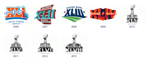
The Super Bowl logo has seen a transition from a creative form to a figurative stencil that’s Roman Numeral and stadium graphic simply are swapped out every year…
Realizing this, he decided to take on the task of designing new hypothetical logos for the fore-coming two Super Bowls. (Note: The NFL will switch from the long standing Roman Numeral distinquishment to numbers starting with Super Bowl 50.)
Super Bowl 50 Concept Identity Rebrand
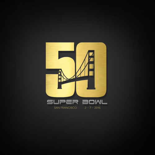
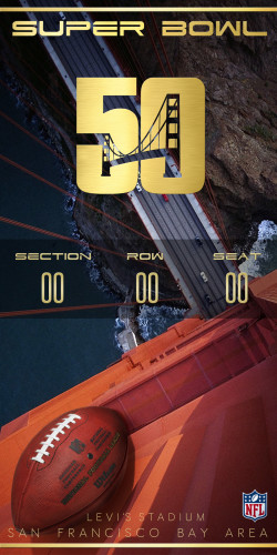
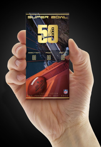
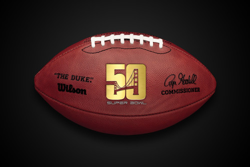
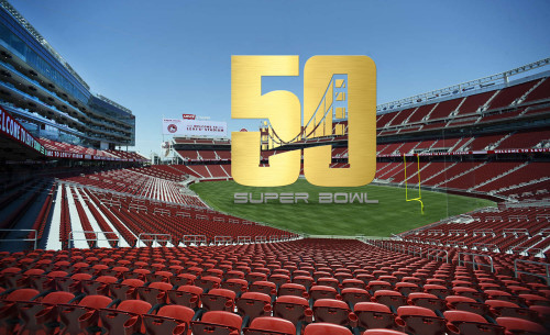
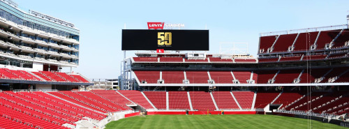
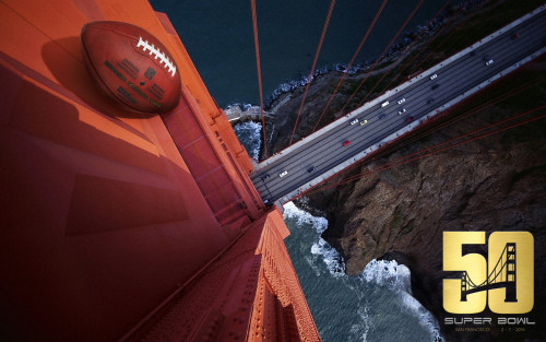
Super Bowl 50 will be played at Levi’s Stadium and hosted by San Francisco and the greater bay area. In order to capture this, he created a composite logo using the negative space of both the ‘5’ and the ‘0’ as an opportunity to use the Golden Gate Bridge in the design. The logo will be gold, both as a change from the usual chrome designs used for the logos, being that its the 50th anniversary game, as well as the symbolism for the “Golden Gate” Bridge.
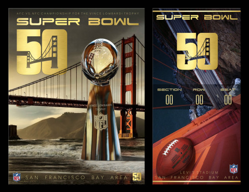
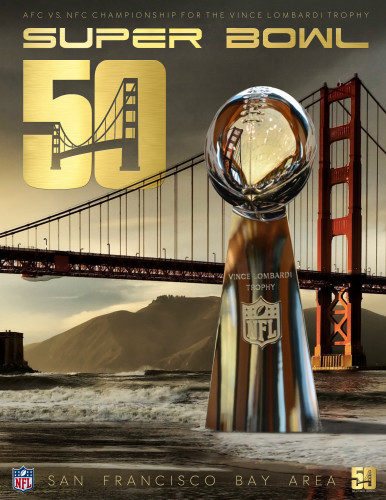
Below is the logo as well as various print applications such as programs and tickets using the concept design.
(Click images to view in high resolution)
inlineg
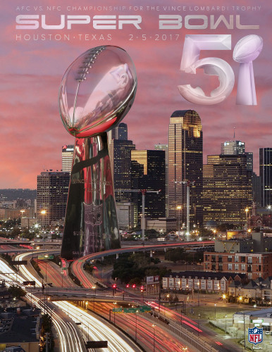
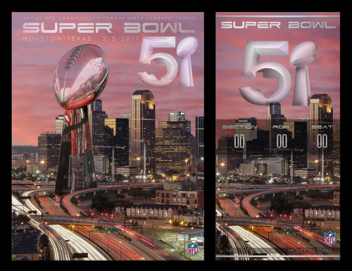
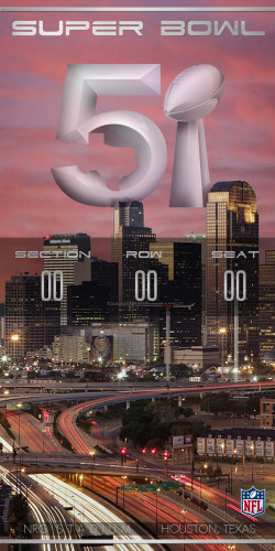
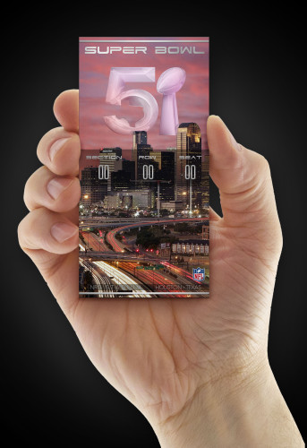
Super Bowl 51 Concept Identity Rebrand
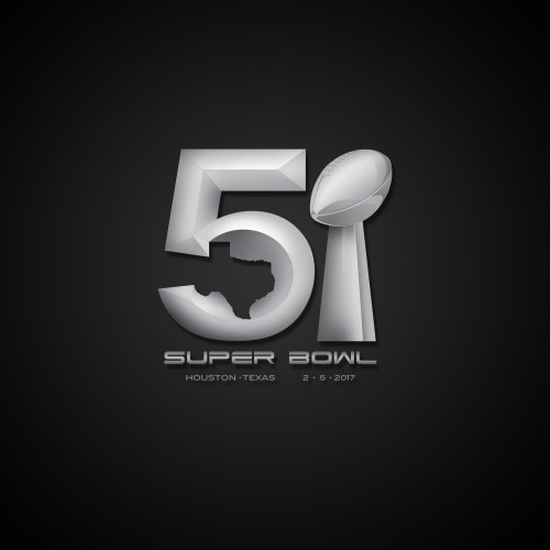
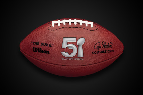
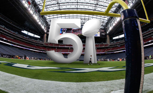
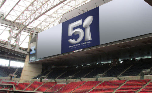
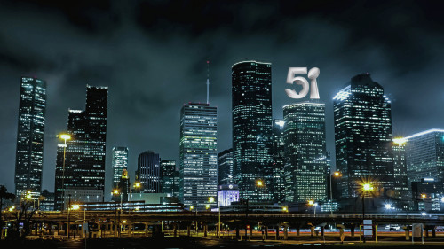
Super Bowl 51 is set to be played in NRG Stadium in Houston, Texas. The inspiration behind this logo was to capture as many references to Texas as well as including ones from the Super Bowl itself. Drawing from the the quote “everything is bigger in Texas,” Hubschman wanted the text to be highly dimensional, catering to a full-bodied logo. The negative space in the lower porton of the ‘5’ is made from the shape of the state, and the ‘1’ is ofcourse, the famed Vince Lomardi Trophy. Both were used in which I belive was subtle enough to where they were realized after the number ’51’ itself.
Which was your favorite? 50 or 51? Feel free to let us know below!

